
Beginner’s Guide to Responsive Web Design: Make Your Site Mobile-Friendly
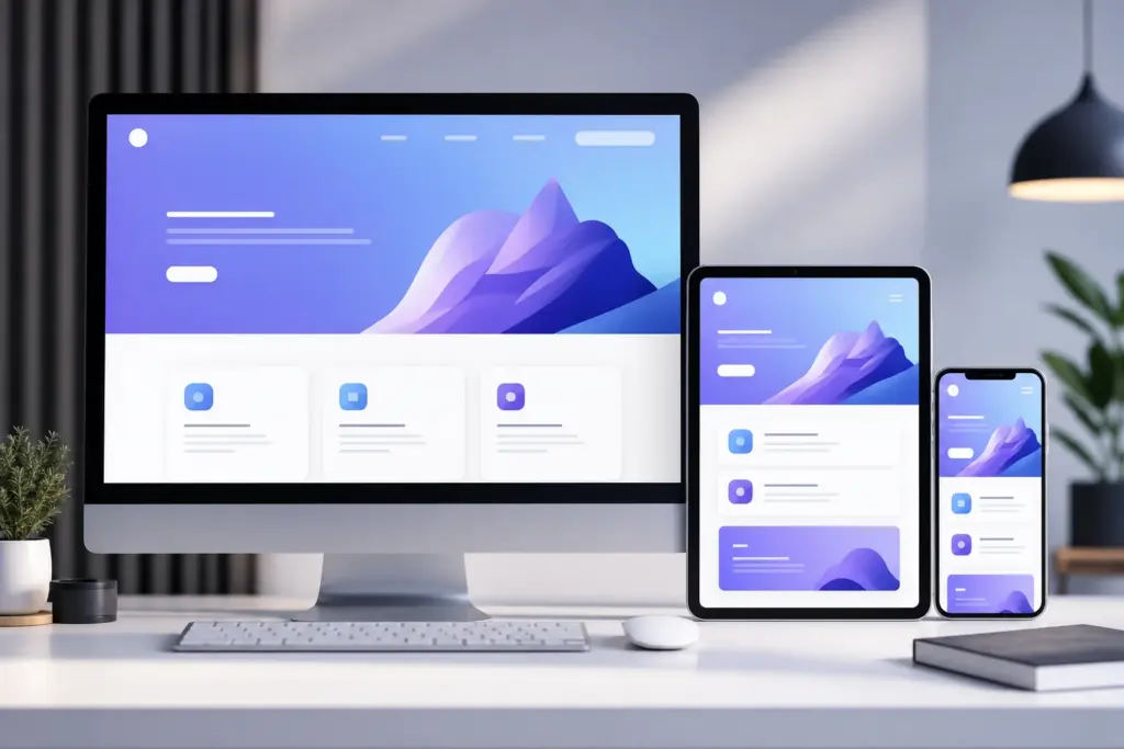
If your website looks great on a laptop but breaks on a phone, you’re losing visitors before they even read your content.
That’s where responsive web design comes in.
This guide walks you through the basics—from what responsive design is, to how you can build it, and even how to become a responsive designer yourself.
How Do I Make My Website Responsive for Beginners?
Start small. You don’t need to be a developer to grasp the basics.
Here’s how to begin:
- Use a mobile-first approach. Start designing for small screens, then scale up.
- Choose a responsive framework like Bootstrap or Tailwind CSS. They handle a lot of the heavy lifting.
- Set your viewport. In your HTML head, include:
<meta name="viewport" content="width=device-width, initial-scale=1.0"> - Use relative units. Swap out fixed pixels (
px) for flexible ones like percentages (%) or viewport width (vw). - Test everything. Use your browser’s dev tools to simulate various screen sizes.
Don’t want to code it all yourself? You can always hire pros for custom website design or full web development services.
Have you checked your site on your phone lately?
What Are the 3 Basic Things Required for Responsive Web Design?
Three core ingredients keep everything flexible:
- Fluid grids
Instead of fixed columns, use proportions. A column might take up 50% of the screen on desktop, 100% on mobile. - Flexible images
Images should resize or scale within their container. Use:
img {

  max-width: 100%;

  height: auto;

}
- Media queries
These let you apply different styles depending on the screen width:
@media (max-width: 768px) {

  .nav-menu {

    display: none;

  }

}
Do you know which of these is missing from your site right now?
How to Become a Responsive Web Designer?
If you’re aiming to build responsive sites for others, here’s a roadmap:
- Learn HTML, CSS, and a bit of JavaScript. Responsive design lives in CSS, but JavaScript helps with interactive elements.
- Practice using frameworks. Bootstrap, Tailwind, and Foundation are great starting points.
- Build projects. Create mock sites, redesign existing ones, or volunteer for nonprofits.
- Stay current. Follow web dev blogs, take online courses, and study real-world websites.
Tip: Your own portfolio should be responsive. If it’s not, clients won’t trust you to make theirs.
What’s stopping you from starting today?
Is Responsive Design UX or UI?
The honest answer? It’s both.
- From a UI perspective, responsive design is about layout, spacing, and visual elements adapting across screens.
- From a UX perspective, it’s about user comfort—can they navigate easily, read content, and tap buttons without frustration?
If your responsive site looks pretty but is hard to use, you’ve nailed UI but missed UX.
Good responsive design respects both.
When was the last time you used your own site on a phone?